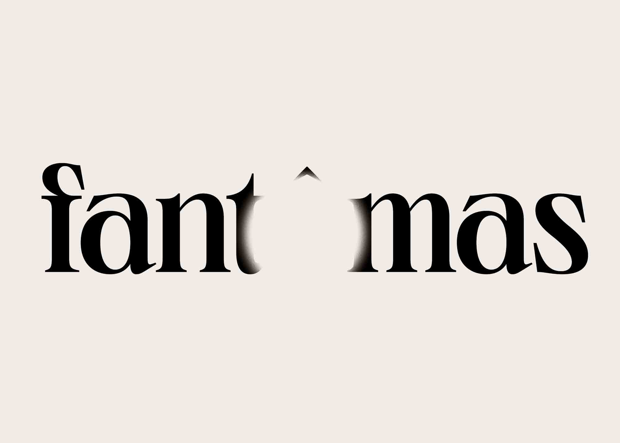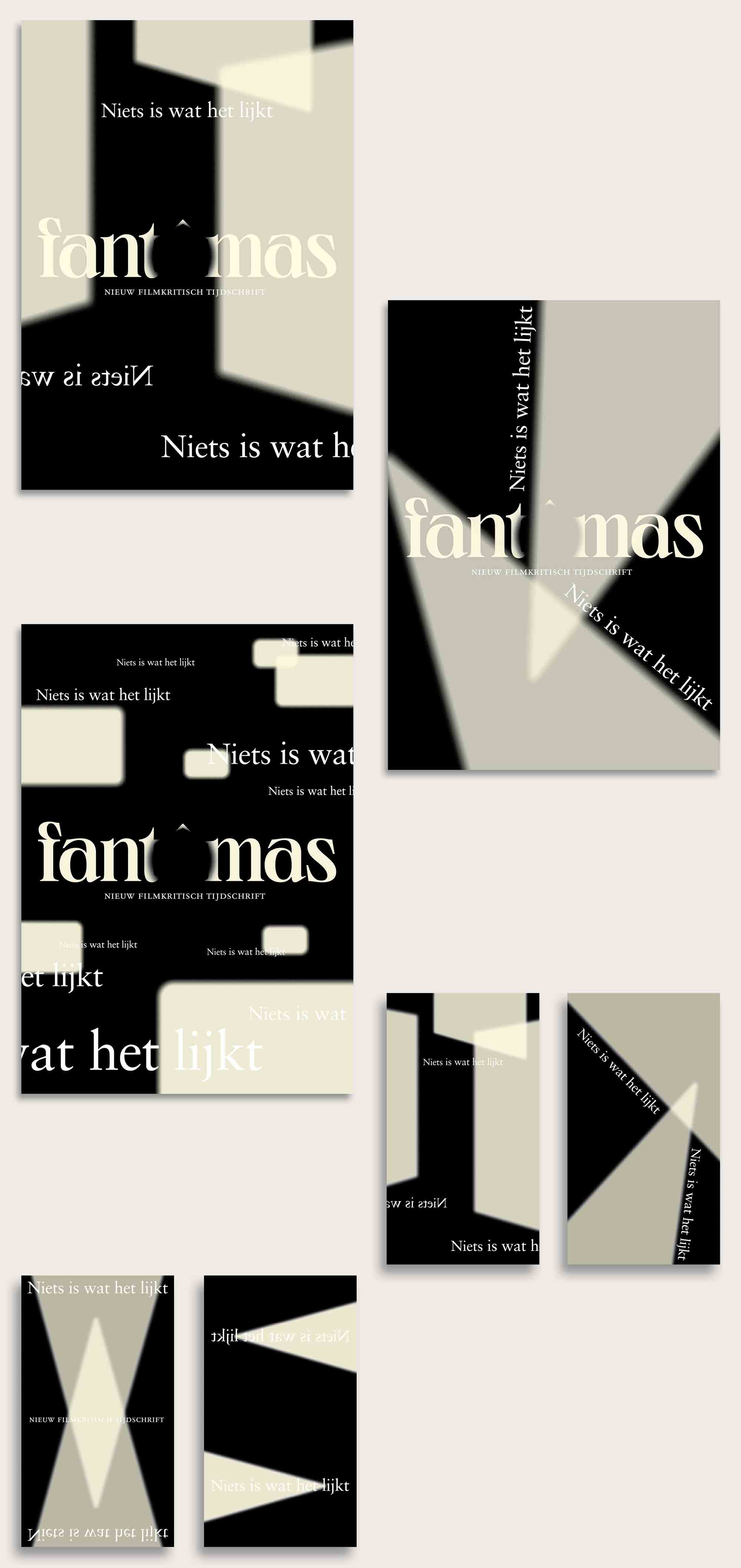


Complete identity design for Fantomas, new belgian online and offline magazine for film critique. The magazine derives it's name from Fantomas - the mysterious antihero from film history with an ever changing identity. The idea of an ever changing identity was used as a conceptual base for the design of the magazine (coming soon). Consequently the rest of the identity was kept simple with direct references to classical typography of the early 20th century. In the identity multiple kinds of serif typefaces - both old (Sabon, Tschichold) and new (Migra & Neue World, Pangram Pangram) - are used alongside each other, providing a stylistic bridges between eras. The page layouts play with the idea of classical type in a carefully thought out grid. This grid further extends to the design of the website.
The design of the logo smartly uses the disappearance of the letter o to depict the projection of movies on a film screen. Hence it demonstrates an openess to talk about film in the broadest sense. Furthermore, the idea of projections and multiple derivatives of film is used in the design of the campaign used for the launch of the magazine. On a black background simple compositions are created with the light and shapes projectors make. The baseline of the campaign nothing is what it seems complement the visuals with a critical note.
Webdesign in collaboration with Systeme-D
2021, identity design, logo, campaign, web design