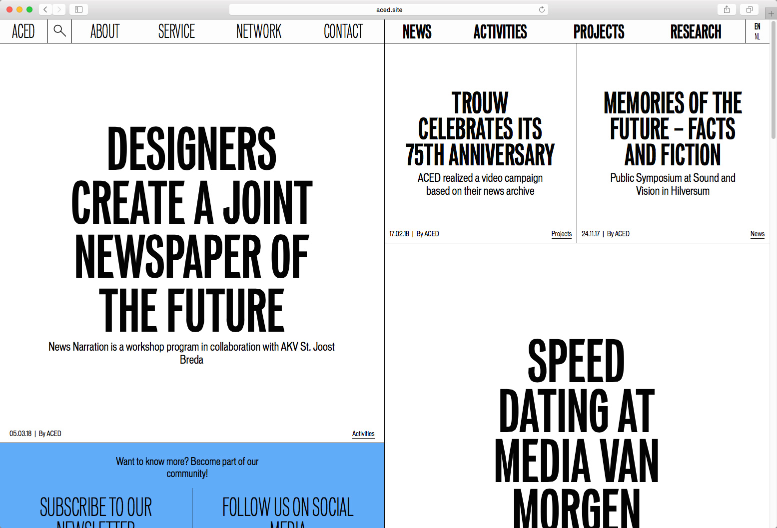
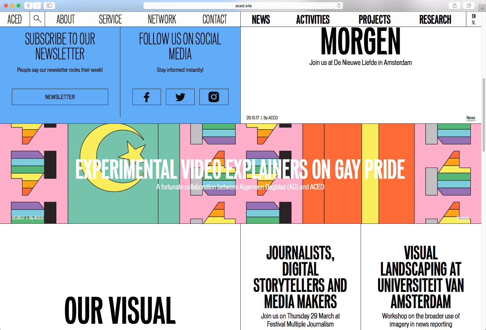
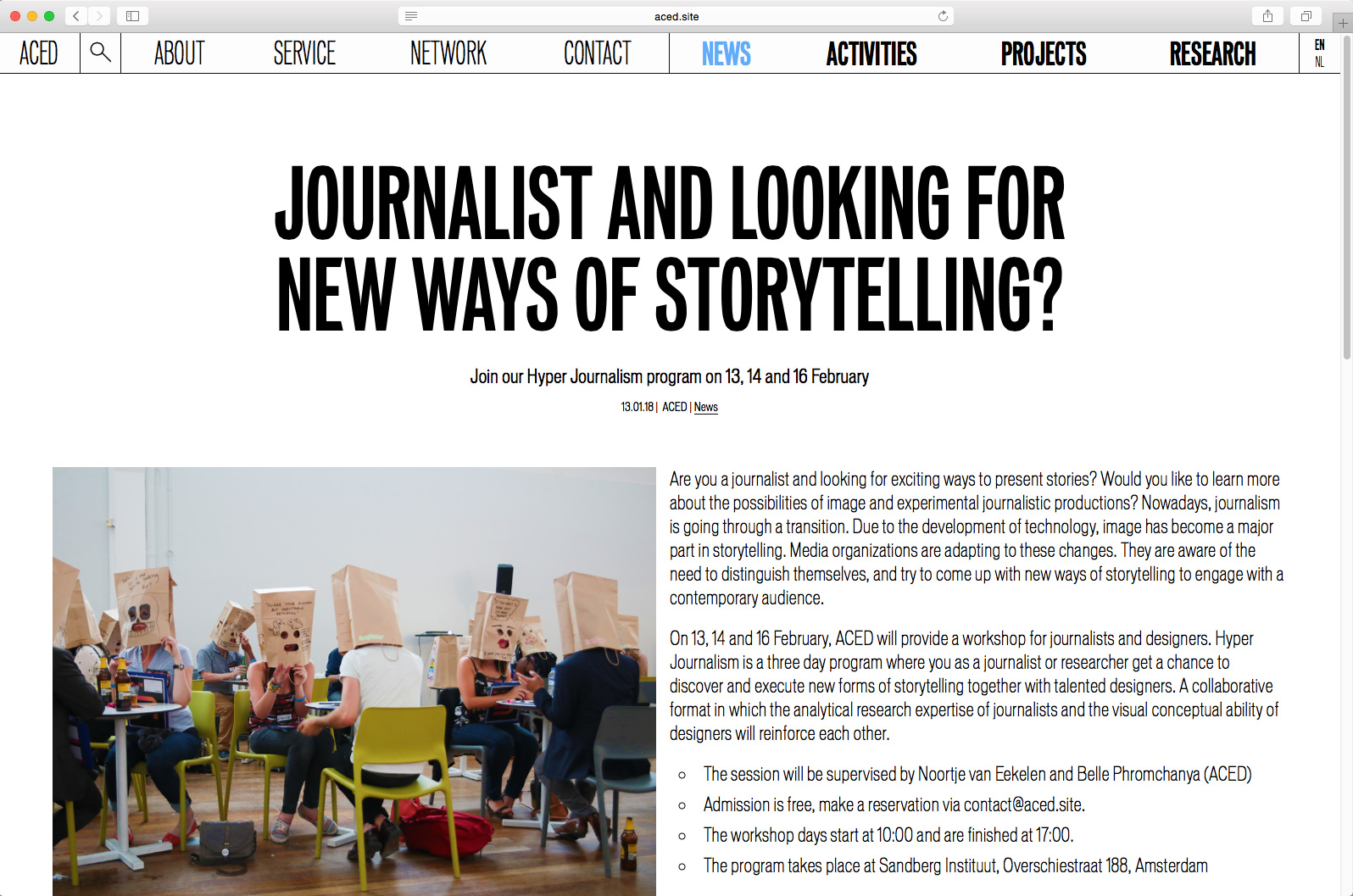
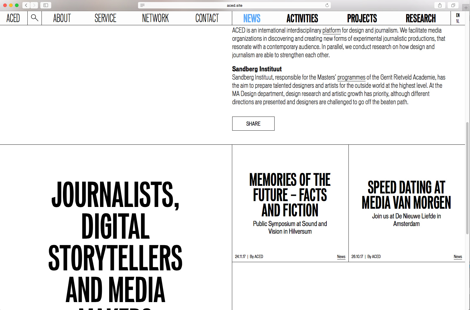
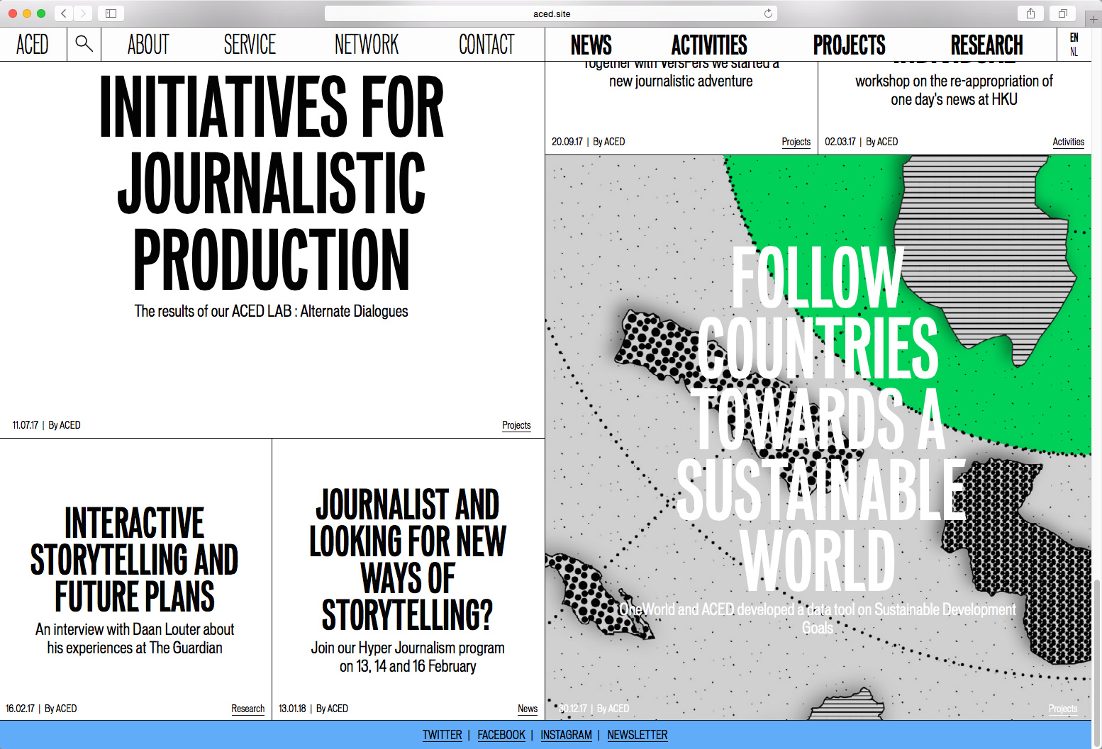
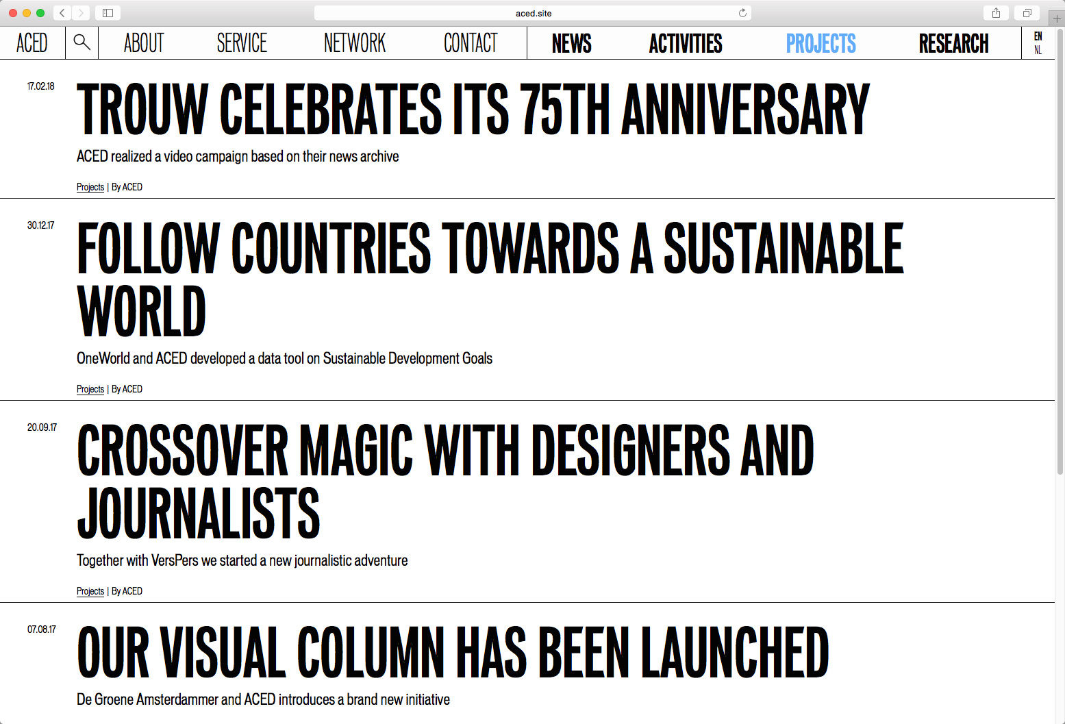
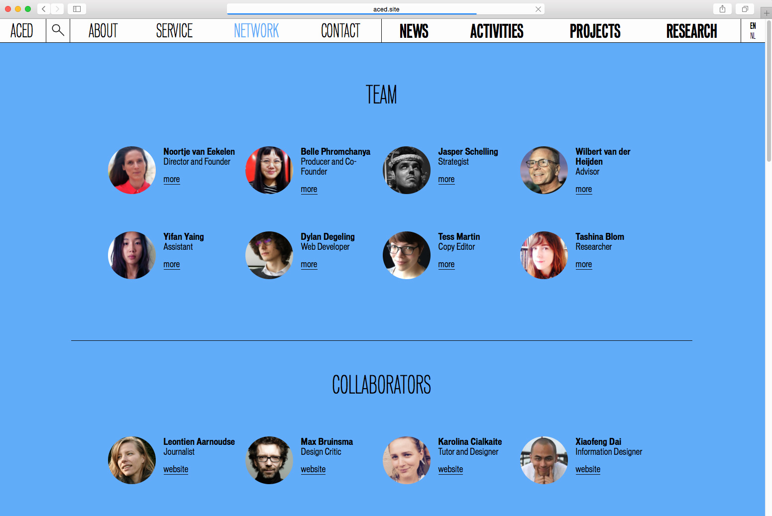
Identity and website design for the dutch platform ACED. The design consists of a sober typographic setup. An extreme compressed font is used for the overall typography and the logo. Headlines are set bold and large, reminiscent of early newspaper designs. On hover images popup under the headlines, giving meaning to the individual posts. Additionally a series of categories are browsable by a simple archive design. Static information pages come on coloured backgrounds separating them from the regular news posts.
Commissioned by ACED | Platform for design and journalism
Programmed by Dylan Degeling
2017, website
Programmed by Dylan Degeling
2017, website